How to Change Link Underline Color with CSS
Indie Guitarist
Last night, when I look at Basecamp website, I notice an interesting CSS stuff.
When I hover the Nav link at the header, there will be a nice yellow highlight appear below the link. This is cool, tho .
When I inspect the a tag, they used text-decoration stuff.
I do a quick research and found this awesome, simple CSS magic to change the underline color.
I already do the research, you just need to grab the popcorn 🍿 and enjoy the journey 🚀.
By default, the color of the underline is set the same as the text color of the link. If the link is blue 🟦, the underline also a blue color 🟦. But, you know right, because of human's creativity(cough, cough...)😆, sometimes we want to give the underline a different color from the text of the link.
There are two ways I found to make this happen. One is using the text-decoration stuff, the second one is using the old border-bottom trick.
personally, I prefer
text-decorationoverborder-bottom. The right tool for the right job. I donno.
✅ text-decoration
text-decoration is the most straightforward way to underline text.
text-decoration-color is what we needed
a {
    text-decoration: none;
    color: blue;
}

/* show underline on hover */
a:hover {
    text-decoration: underline;
    text-decoration-color: red;
    -webkit-text-decoration-color: red;
}
note:
-webkitis for Safari.
This is the only thing you needed. If you want to customize more, read more :P
🌈 text-decoration properties
text-decoration works fine by itself, but you can add a few properties to customize the way it looks:
1) text-decoration-color
text-decoration-color lets you change an underline’s color separately from its text color.
2- text-decoration-skip
This property will skip the edgy alphabet like g, p, f. It didn't go through it. Examples :
3- text-decoration-style
text-decoration-style give you a free underline design using different values. No need to add SVG.
Here are the available values that you can use:
dasheddotteddoublesolidwavy
note: This example is from Mozilla MDN. You also can seperate the
text-decorationintotext-decoration-colorandtext-decoration-style.
a {
 text-decoration: underline;
 text-decoration-color: red;
 text-decoration-style: wavy;
}
4- text-underline-offset
This is quite cool. It can be used to define how far the line is from the initial text.
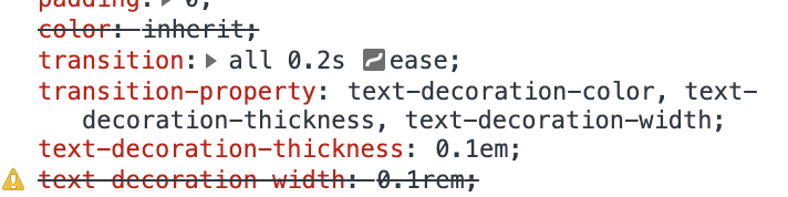
5- text-underline-thickness
This property is used to tell how big the underline is.
✅ border-bottom
disclaimer: if you happy with the first trick, just go with it. This is just another same trick.
If we want to use border-bottom trick, first we need to remove the underline with the text-decoration property value of none. Then we add the border-bottom property with 3 short-hand CSS values of 3px solid red.
3px = Variable of the underline width in pixels
solid = Border style (solid, dotted, or dashed)
red = Color code. Hex also can, like #999999
I add this cool trick into my blog
I also add this awesome tricks into my own blog. I implement it on every a tag or any link-related tag.
Pretty cool, hah... 😎
Thank you for traveling with me 🚀, I hope you enjoyed the journey 🔥.
The End
resources:


